Colour has a quiet power in a home. It changes the way a room feels at 7 a.m., how a candle glows at dusk, even how long you linger at the kitchen table after dinner. And in 2026, the conversation around interior colour is becoming more thoughtful than ever. Sustainable homes are no longer just about solar panels, reclaimed timber, or low-energy appliances; they are also about emotional longevity. In other words: choosing colours you will still love years from now, in homes that respect the planet as much as the people living in them.
If you have ever stood in front of a paint chart feeling oddly overwhelmed by 64 shades of “warm white,” you are not alone. The good news is that 2026 colour trends for sustainable interiors are moving away from disposable, overly trendy palettes and towards grounded, nature-led schemes with real staying power. Think deeper earth tones, mineral-inspired neutrals, softened greens, weathered blues, and warm, light-reflecting hues that work beautifully with eco-friendly materials.
There is a kind of poetry in that shift. It reflects how many of us now want our homes to feel: calm, durable, and connected to the outside world. Not sterile. Not fashionable for six months and then suddenly tired. Just quietly beautiful.
Why colour trends are changing in sustainable homes
For years, many interiors followed a cycle of fast trends: bold accent walls, ultra-cool greys, then high-contrast black-and-white schemes. They looked sharp in photos, but they often demanded frequent repainting, more purchases, and a constant chase for novelty. That approach sits awkwardly beside sustainable living.
In 2026, colour trends are being shaped by a few clear priorities:
It is a practical shift as much as an aesthetic one. When colours work with natural light, timber grain, linen textures, stone, clay plaster, and low-VOC paints, they create interiors that feel more coherent and often less energy-intensive. A lighter wall can bounce daylight deeper into a room. A warmer neutral can make a north-facing space feel less chilly. A grounded colour palette can help a small home feel restful instead of visually crowded.
And frankly, sustainable interiors should not look like they were assembled by a committee armed with a mood board and a deadline.
The key colour directions for 2026
Earthy greens are becoming the new neutral
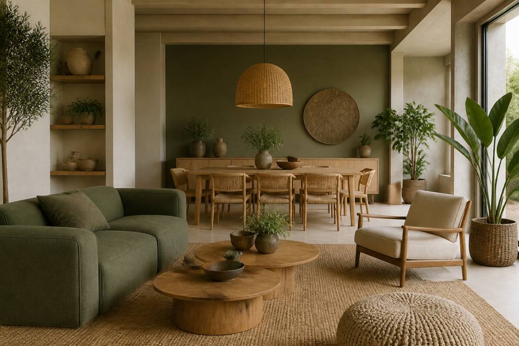
Green is continuing its reign, but in 2026 it is becoming softer, dustier, and more nuanced. We are moving away from bright botanical greens and into sage, eucalyptus, olive, moss, and muted fern tones. These shades feel deeply linked to sustainability because they echo the landscapes many eco-conscious homeowners are trying to protect.
What makes them so effective is their flexibility. A pale sage can read almost neutral in a bright room. A deeper moss can bring warmth to a study, bedroom, or reading corner. Paired with oak, rattan, recycled glass, or linen upholstery, green creates the sense of a room breathing at an easy pace.
If you want a simple styling rule: use earthy green where you want the eye to rest. It works particularly well in spaces meant for slowing down, whether that is a bedroom, a bathroom with clay tiles, or a kitchen with handmade ceramic details.
Warm neutrals are replacing cold minimalism
Cool greys have had a long run, but 2026 belongs to warmer, softer neutrals. Think mushroom, oat, sand, putty, bone, and pale terracotta-tinted beige. These tones feel inviting without being sugary. They also partner beautifully with sustainable materials, which often carry their own texture and subtle colour variation.
There is a reason these shades are rising in popularity: they make homes feel human. A room painted in warm neutral tones can still be minimal, but it will not feel severe. Instead, it gives you a kind of quiet backdrop that lets natural materials speak. That reclaimed pine table? The hand-thrown vase? The wool throw from a local maker? They all get their moment.
For eco-friendly interiors, warm neutrals are also useful because they age well. Small marks, shifting light, and everyday life tend to blend into them more gracefully than with stark white or cooler greys.
Mineral blues are adding depth without heaviness
Blue is not disappearing, but it is maturing. In 2026, the strongest blue tones for sustainable interiors are inspired by slate, sea glass, stormy skies, and weathered ceramics. These mineral blues feel less polished and more elemental. They are particularly effective in homes that already lean into natural textures.
A smoky blue in a hallway can create a beautiful sense of transition. A faded indigo in a bedroom can feel cocooning without becoming dark. In a kitchen, a muted blue on cabinetry can provide contrast against timber, brushed metal, or stone worktops without shouting for attention.
There is also a subtle environmental logic here. Blue is often associated with water, sky, and atmosphere — elements that remind us of wider ecological systems. Used carefully, it introduces a feeling of calm scale. Your living room does not need to imitate the Mediterranean coast to benefit from that sense of openness.
Clay, terracotta, and sun-baked tones are staying strong
Warm clay colours have been moving steadily upward for several seasons, and in 2026 they remain a major influence. Terracotta, rose clay, cinnamon, ochre, and softened rust are ideal for sustainable interiors because they feel rooted in the earth rather than extracted from a passing trend cycle.
These tones are especially good in rooms that need warmth: dining spaces, entrance halls, or open-plan areas with lots of hard surfaces. They can soften the echo of concrete floors, balance cool metal fixtures, and complement natural plaster beautifully.
Used in moderation, these colours bring a kind of lived-in glow. It is the interior equivalent of late-afternoon sunlight on a clay wall in a quiet hill town: never flashy, never forced, just quietly convincing.
How to use these colours in a sustainable way
Colour trends matter, but the most sustainable choice is rarely the trendiest one. A beautifully painted room is only truly sustainable if it avoids unnecessary repainting, wasteful overbuying, and short-lived enthusiasm. So how do you bring 2026 colours into your home without falling into the trap of constant updates?
Start with the materials already in the room
Before choosing a shade, look at what is already present: floorboards, window frames, stone, brick, upholstery, and wood tones. Sustainable interiors work best when colour supports the materials rather than fighting them. If your room already has warm oak and natural textiles, a mushroom or sage palette may feel harmonious. If you have cooler stone or concrete elements, mineral blues or olive tones can add balance.
The goal is not to “cover up” the room, but to let it become more itself.
Use colour to improve daylight, not just decoration
One of the overlooked strengths of thoughtful colour choice is its impact on light. In a sustainable home, every bit of daylight matters. Pale warm neutrals can help a compact or dim room feel brighter without relying too heavily on artificial lighting. Softer greens and blues can maintain a sense of freshness while still reflecting light in a gentle way.
For north-facing rooms, avoid shades that lean too grey or icy, as they can make the space feel colder. For south-facing rooms, richer earth tones often work beautifully because the light can handle them. As ever, sample pots are your friend. Paint large swatches. Watch them at breakfast and after sunset. Paint has a habit of changing its personality when the weather does.
Choose low-impact finishes and low-VOC paints
Colour is only part of the story. The product itself matters too. In 2026, sustainable interiors are increasingly defined by finish quality and ingredients rather than just the visible hue. Low-VOC and zero-VOC paints help reduce indoor air pollution, which is especially important in homes designed for health as well as comfort.
Also pay attention to finish. A matte or limewash-style surface can give earthy tones more depth and softness. A durable eggshell finish may suit higher-traffic areas such as kitchens or hallways. The right finish helps the colour last longer, which is sustainability in practice, not just in theory.
Think in layers, not statements
One of the most useful design shifts for 2026 is moving away from “feature wall” thinking and towards layered colour. This is particularly effective in sustainable homes, where you may be combining old and new materials, vintage finds, and responsibly sourced furniture.
Instead of one loud statement colour, try building a palette with three or four related tones:
This approach feels calmer and more timeless. It also makes it easier to refresh a room without starting from scratch. Swap cushions, artwork, and lampshades; the backbone of the room remains intact.
Room-by-room colour ideas for 2026
Living rooms: quiet warmth and easy layering
In the living room, the trend is toward welcoming palettes that support both relaxation and conversation. Warm neutrals with olive or mineral blue accents are especially strong. If your living room is small, a pale mushroom or greige can create openness while still feeling warmer than stark white. For larger rooms, deeper greens or clay tones can help define areas without walls.
Look for opportunities to repeat colour in subtle ways: a cushion, a ceramic lamp base, a framed print, a throw. Repetition creates calm. It also stops the room from feeling like it was assembled in a hurry after a late-night online shopping spree.
Bedrooms: restful, muted, and cocoon-like
Bedrooms in 2026 are embracing serenity. Sage, dusty blue, softened taupe, and pale clay are all excellent choices. These shades support sleep and make a room feel enclosed in the best sense. Not claustrophobic — more like a gentle retreat after a noisy day.
If you want to keep the room feeling airy, use a warmer off-white on the ceiling and trim, then bring in colour through bedding, curtains, or an upholstered headboard. Natural fabrics such as linen, organic cotton, and wool deepen the effect without adding visual clutter.
Kitchens: grounded colour with practical endurance
Kitchens need colour that can handle mess, steam, sunlight, and repeated cleaning. That is why 2026 trends here are leaning toward durable, earthy shades: olive cabinetry, stone-inspired greys, clay tiles, and muted blue lower units paired with warm timber or neutral uppers.
In sustainable kitchens, colour should support longevity. A cabinet colour that feels good with different worktops, handles, and flooring will outlast a trend-driven makeover. If you are hesitant, use colour on lower cabinets or a pantry wall rather than everywhere. It is a softer commitment and often more effective.
Bathrooms: spa-like without becoming generic
Bathrooms are moving away from glossy white sameness and toward textured, nature-inspired palettes. Pale sage, sea-glass blue, mineral beige, and chalky clay can create a spa-like feeling without copying the same look seen in every hotel bathroom on the internet.
Pair these colours with recycled tiles, brushed brass, unfinished wood accents, or stone basins. The result is a room that feels clean, but not cold. Fresh, but not overly polished. That balance is what sustainable design does best.
How to future-proof your colour choices
If you want your home to stay relevant beyond 2026, choose colours with depth, not gimmicks. Ask yourself a few simple questions before committing:
That last question matters more than it might seem. A colour palette that helps your home feel brighter, softer, and more cohesive can reduce the urge to redecorate constantly. And a home that does not require endless updates is, by design, a more sustainable one.
There is also room for a little personality. Sustainable interiors are not supposed to become bland or overly disciplined. If you love a colour, use it. If a room needs a spark, introduce it through a lamp, a painted shelf, or a single piece of art rather than a full-room overhaul. Sustainability thrives on restraint, not boredom.
The real trend for 2026: colour with staying power
Perhaps the most interesting thing about colour trends for sustainable home interiors in 2026 is that they are becoming less about trendiness and more about belonging. The shades leading the way are not just visually pleasing; they are grounded, tactile, and sympathetic to the way people actually live.
Earthy greens, warm neutrals, mineral blues, and clay-rich tones all share one important quality: they feel connected to the natural world. That makes them a strong fit for homes designed with low-impact materials, better energy use, and a more intentional pace of living.
If you are updating a room this year, there is no need to chase the loudest colour in the showroom. Start with the light in your home, the materials you already love, and the feeling you want to create when you walk through the door after a long day. The right colour will not just decorate the room. It will help it breathe.